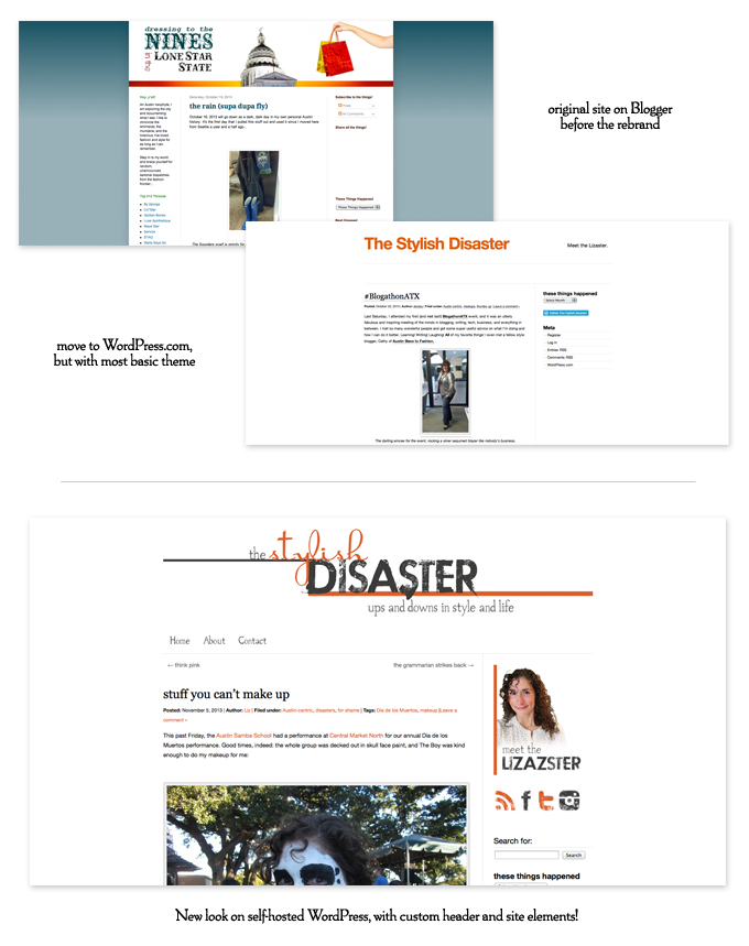
Recently, my good bloggy friend Liz (hi Liz!) decided to do a complete rebrand of her blog. Previously blogging as ‘Dressing to the Nines in the Lonestar State’, she decided ‘The Stylish Disaster‘ was more fitting for her snarky lifestyle content (and also less of a mouthful). And she needed a new look to go with it. She wanted something clean and uncluttered, but still interesting. Luckily, she’s friends with a graphic designer who was only too happy to take her on as a client – me! See the transformation below:


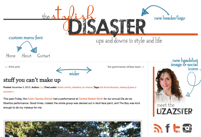
Here’s a closer look at some of the new elements I created for her:

Liz came out with a new header/logo, a custom menu, a cut-out headshot image, new social icons, a new favicon, and some tweaks to her theme including making the overall layout wider. It was fun getting to work with her and figuring out a new look that she’d love! Really, any excuse I get to play with fonts makes me a happy camper. 🙂
Go say hi to Liz, and if you’re in need of a designer yourself, head on over to my services page.
Happy weekend!


