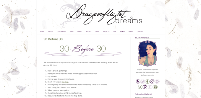
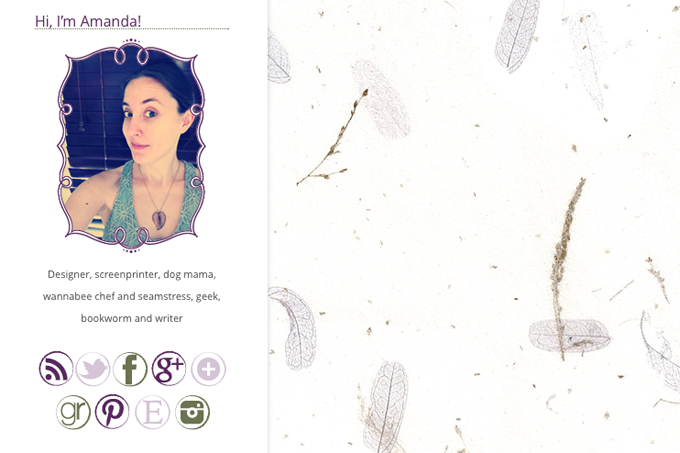
Surprise! The redesign bug bit me hard this weekend, and I’ve revamped the look of the blog and the shop, complete with new logo. If you’re in an RSS reader or on Bloglovin, you may want to click over for the full effect. I’d been increasingly feeling that the old logo wasn’t really fitting anymore. This new one I think looks both more whimsical and more modern, which I love. The new background is actually one of the papers that I screen print on. I just popped it in my scanner and did some light editing. I like the airy, textural feel it lends without being overwhelming.
New logo and blog look:


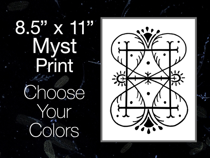
For the shop, I wanted to use the same new logo, but when I put in a shop banner similar to my blog header, it just wasn’t visually striking or attention catching. I definitely needed something more bold for the shop, to go with the bold colors and designs there. So I reversed out the background to a black version, and tweaked the logo to work on black, and voila! I think the reversed background gives it a dreamy, mysterious feel, which is perfect. I also revamped the graphics for my customizable art prints to match.


I’m sure there’s still things and small details that will be tweaked over the next week or so, but for the most part the redesign is done. I dub that a productive weekend. Also, just a reminder, if you’re on the WordPress platform and want a new look for your blog, I do offer design services. 😉
So! How do you like the new look?


