A little while ago, I put out a call on Twitter for a free sidebar ad design. My motives were two-fold: 1) I needed a break from the project I was working on, and 2) I wanted to publicize the fact that ad design is one of the design services that I offer, and could use these freebies as examples of my work.
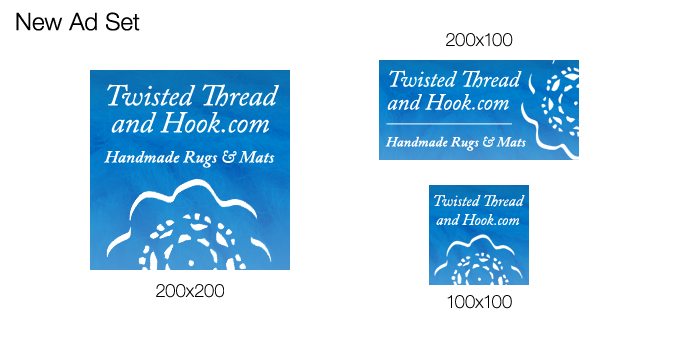
Magda of Twisted Thread & Hook answered the call. She runs a shop specializing in wonderful handcrafted rugs and mats with a nautical twist. Based on her current branding (heavy on the blue) and product line-up, these are the ads I came up with for her:

I focused on the texture of her products, but kept the blue look and font styling. I also used the doily element from shop banner as a larger decorative element. I did a whole coordinating set, rather than just one size, so that the new ads would be versatile.
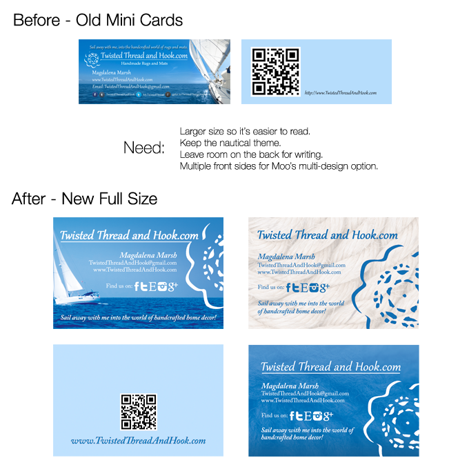
Magda said she loved them, and I guess it was true because then she hired me to design some new business cards for her! 🙂 The current cards she was using were just too small to read, and she wanted to give them a refresh overall. See what I did:

You’ll notice that one of those front designs matches the new ads we had done. Her reaction? “These look great! I cannot decide which one I like better!” Luckily, she didn’t have to, as Moo printing lets you have multiple different designs on one side of the card. 😉 And now she has a fun refresh for her existing brand! She was a pleasure to work with, as well. Don’t forget to go visit her shop!
If you’re looking for a little spring cleaning for your brand, I can help you out, too. Check out the design services that I offer, and drop me a line.
What do you think of Magda’s refresh? When’s the last time you gave your business a facelift?


