
This originally appeared over at The Streeters Unlimited as a guest post.
With so many blogs clogging the interweb today, it can be hard to attract a following in the first place, let alone grow it. And aside from all the advice about networking, and having great content, one thing you can do immediately and easily is make sure your blog is a pleasant place to visit. Giving a visitor a happy browsing experience increases the likelihood that they’ll be back. So today I have a quick list of tips for how you can make someone’s visit to your blog a more positive experience overall. I’m basing this list off of years of client feedback, as well as being an avid reader of a whole lot of blogs, and a blogger myself. These tips are fairly universal, since they don’t have anything to do with what kind of content your blog has, and are really just more about how your blog works. Come to think of it, these are good tips for ANY website, not just blogs. I hope you find this useful!
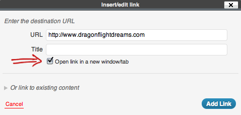
1. Open links to outside sites in a new window. This is a fairly simple one, but one I’ve noticed many bloggers tend to overlook. When you are linking to a page that is on a different site, you should always set it to open in a new window. That way, they can leave your blog to read the article or browse the store that you linked to, and when they are done and close that window, the window with your blog is still there and they can continue to read your blog post. How many times have you seen a giveaway post where one of the methods of entry is ‘visit this shop and comment with your favorite item’? Yet when you click the link, it takes over the window and makes it a pain to get back to the actual giveaway post itself in order to leave said comment. Or you’re reading a post about somebody’s sponsors, and click a link to visit a blog and it opens in the same window; you weren’t done reading the whole post, but you’ve been kicked off the original site nonetheless. A pain, am I right? Aside from the user experience perspective, as a blog owner you should want to keep people on your site as long as possible – so why set up your links to always kick people off?
Luckily, it’s a fairly simple fix. If you’re hand-coding or in code view, simply add target=”_blank” into the link tag. So it’ll look like this (but with proper brackets): {a href=”http://www.outsidelink.com” target=”_blank”}Link Name{/a}. If you’re using WordPress, simply check the option in the link dialog box that says ‘open link in a new window/tab’. I’ve never used Blogger, so I can’t say for sure, but I imagine they have a similar option in their link dialog box.
2. Turn your auto-play music off. Look, if you want to have a playlist of music on your site, that’s all well and dandy. But for crying out loud give people the option of whether they want to turn it on or not instead of just automatically blasting it at them! Maybe they are already listening to music and your music is clashing something fierce. Maybe they have very different music tastes than you and would never voluntarily listen to your choices. Maybe they simply don’t like trying to read a blog post with random lyrics flying at them. Maybe they forgot they had their computer speakers turned up really loud and you just scared the beejezus out of them and annoyed them all in one swoop. See how many different ways you’ve already made a somewhat negative impression on the user, with just one feature of your site?
Again, it’s a simple fix. Turn off auto-play. This way, if the user wants to listen to your music selection, they can hit play and do so. But it won’t automatically start playing when your site loads. Now, there are a lot of different audio playlist widgets out there (and video, too; those fall under this purview as well), so I can’t give exact instructions on how to go about this. But check the settings for your specific widget. If there’s an option for ‘Play on load’ or ‘Auto-play’ – turn it to No! If you’re the adventurous type and feel like digging into your widget’s code, look for something similar to ‘autoStart=true’ and change it to ‘autoStart=false’.

3. Make important things easy to find. This is another pretty simple idea, but it’s amazing how often it’s overlooked. If you want people to follow your blog/you, you need to make it easy for them to do so – i.e. prominent links to your Twitter, Facebook, RSS feed, what have you. They shouldn’t have to dig and search for those. If you have a shop, it should get a link in your main navigation. If you offer sponsor spots or partnerships, you should most definitely have an easy way for people to learn more about that. Your main navigation should have (at minimum): Home, About/Contact (these can be the same page or two different pages, depending on your preference – but if 2 different pages, both should be in the main nav), Shop (if you have one), and Sponsor (if you offer that). Whether you add links to specific blog post categories, or other pages you create in that main navigation is up to you, but those are the basic minimum. Links to RSS and social media sites should sit somewhere in the header (top of page) or the top of your sidebar, not way down at the bottom. Having a Search option, an option to look at a specific category, and an easy way to browse the Archives are also a good idea. The main goal is to make it ridiculously easy for a user to find whatever it is they may be looking for.
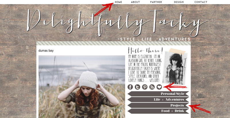
A great example of excellent navigation setup is Elizabeth’s site Delightfully Tacky. She uses a a top navigation with main pages (including those I said are the bare minimum!), and a second menu in the sidebar for different categories of blog posts. Her social media icons are directly below her intro portrait in the sidebar. Learn from the her, grasshoppers.
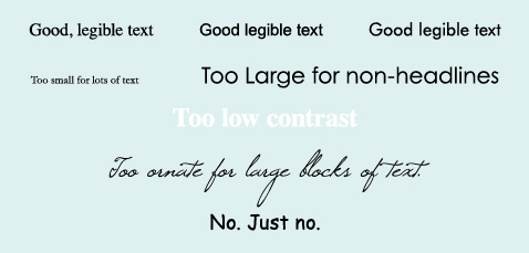
4. Make sure your type is readable. What good is writing a brilliant blog post if no one can read the dang thing? Make sure your site is readable. Readability applies to both font size, and font color. Check it in different internet browsers, and on different computers if possible, to make sure it shows up reasonably well in all of them. It’s maddening, but different browsers interpret font size settings differently – 12px one place is not the same as 12px in another. A 12px font is pretty standard for general paragraph type, but depending on the specific font you’re using it could be anywhere from 10px to 14px. Headlines, of course, are generally larger than that and up to your discretion. Also make sure there is enough contrast between your background color and font color; if people have to squint to make out letters, it needs adjusting. Generally speaking, dark type on a light background is less strain on the eyes than the reverse. And despite popular myth, there is no difference in readability between serif fonts (Times, Garamond, Palatino) and sans-serif fonts (Arial, Helvetica, Futura) as long as it’s of a readable size. It’s probably a good idea to stay away from script fonts for large blocks of text, though (for headlines/highlight text it’s fine – i.e. small doses). But for the love of all that is good, begging from the bottom of my soul as a designer, please don’t use Comic Sans. It only looks good for 5 year olds and elementary schools (and the latter is questionable).
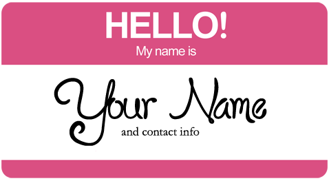
5. Have at least one easy way to contact you. Again, this seems like common sense. Readers should have some way to contact you. It can be whatever you want: a plain old email link, a spam defeating name [at] mail [dot] com, a contact form, even just your social media site links if that’s your preference. But there should be at least one, and it should be easy to find. You could miss out on some awesome connections and opportunities if you skip this step. And don’t forget to tell readers your name so they know who to address in their correspondence! True story: the other day I was trying to email someone about advertising on their blog. I’d been to the blog before, but they didn’t sign their posts with a name. The About page did not reveal a name. The email address was easy to find, but it was one of the sitename@mail deals. I could not find her name anywhere on her site. And I scoured it. I eventually only found out her name by pulling an internet-stalker, going to her Etsy shop, going to the shop owner’s profile (username was also the shop name), and finally found she had signed her intro paragraph with her name. Ridiculous, right? Don’t be like that.
How about you, reader? Any tips for better blog user friendliness?


